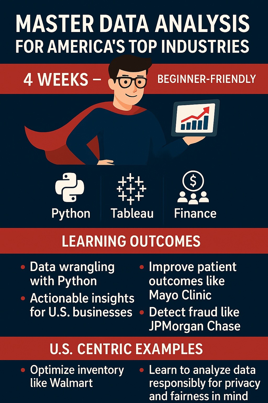
Unlock Your Data Superpowers: Master Data Analysis for America’s Top Industries
Unlock Your Data Superpowers: Master Data Analysis for America’s Top Industries
"Learn data analysis with Python and Tableau in this 4-week course for beginners! Tailored for U.S. industries like retail, healthcare, and finance, master data wrangling, visualization, and storytelling with ethical AI. Enroll at asktenali.com to kickstart your career in America’s data-driven economy."
Target Audience: U.S.-based beginners in data analysis
Course Duration: 4 weeks
Table of Contents
Introduction to Data Analysis
Data Analytics with Python: Master Data Wrangling
Data Visualization Mastery: Create Impactful Charts with Tableau
Python for Data Analysis: From Basics to Insights
Business Data Analytics: Turn Numbers into Strategies
Data Storytelling: Visualize and Present Data Like a Pro
Conclusion and Career Pathways
Additional Resources and Glossary
Chapter 1: Introduction to Data Analysis
What is Data Analysis?
Data analysis is the systematic process of collecting, cleaning, transforming, modeling, and interpreting data to extract actionable insights. It’s a cornerstone of decision-making in modern U.S. industries, enabling organizations to optimize operations, enhance customer experiences, and drive profitability. For example:
Retail: Walmart analyzes customer purchase data to optimize inventory and personalize marketing.
Healthcare: Mayo Clinic uses patient data to improve treatment outcomes and reduce costs.
Finance: Goldman Sachs leverages transaction data to detect fraud and assess investment risks.
Data analysis involves both technical skills (e.g., coding, visualization) and critical thinking to translate numbers into strategies. This course equips beginners with these skills, focusing on practical applications.
The Importance of Data Analysis in the U.S.
The U.S. is a global leader in data-driven innovation, with a projected 25% growth in data-related jobs by 2030, according to the Bureau of Labor Statistics. Key industries include:
Retail: Companies like Target use data to predict consumer trends, such as seasonal demand for electronics.
Healthcare: Providers like Kaiser Permanente analyze patient data to comply with regulations like HIPAA while improving care.
Finance: Banks like JPMorgan Chase use analytics to manage risks and comply with the Gramm-Leach-Bliley Act (GLBA).
The demand for data analysts in the U.S. is high, with entry-level salaries ranging from $60,000 to $100,000 annually, making it an accessible and lucrative career path for beginners.
Ethical AI in Data Analysis
Ethical AI ensures data analysis is fair, transparent, and respects user privacy. Key considerations include:
Bias Mitigation: Avoid algorithms that discriminate (e.g., biased credit scoring in finance).
Data Privacy: Comply with U.S. regulations like HIPAA and GLBA.
Transparency: Clearly explain how insights are derived to build trust.
For example, a healthcare analyst must anonymize patient data before analysis to protect privacy. This course emphasizes ethical practices to prepare you for responsible data handling.
Course Objectives
This 4-week, beginner-friendly course is designed to:
Teach data wrangling using Python to clean and prepare datasets.
Enable creation of impactful visualizations with Tableau.
Equip you with Python skills to derive insights from data.
Show how to apply analytics to U.S. business contexts (retail, healthcare, finance).
Develop data storytelling skills to communicate findings effectively.
How to Use This Course
Each chapter includes:
Detailed Explanations: Core concepts broken down for beginners.
Step-by-Step Tutorials: Hands-on guides using Python and Tableau.
U.S.-Centric Case Studies: Real-world examples from retail, healthcare, and finance.
Activities: Practical exercises to reinforce learning.
Resources: Links to datasets, tools, and further reading.
Getting Started
To begin, you’ll need:
A computer with internet access.
Python 3.10+ and Tableau Public (free tools).
A willingness to learn and experiment with data.
Let’s dive into the exciting world of data analysis, tailored to the U.S. market!
Chapter 2: Data Analytics with Python: Master Data Wrangling
2.1 Introduction to Data Wrangling
Data wrangling is the process of transforming raw, messy data into a clean, organized format suitable for analysis. It’s often the most time-consuming step, but it’s critical for accurate insights. For example, a U.S. retailer might wrangle sales data to identify top-performing products, while a hospital might clean patient records to analyze treatment outcomes.
2.2 Why Python for Data Wrangling?
Python is a versatile, beginner-friendly language widely adopted in the U.S. for data analysis. Its key libraries include:
pandas: For data manipulation and analysis.
NumPy: For numerical computations.
OpenPyXL: For working with Excel files, common in finance.
Python’s open-source nature and extensive community support make it ideal for beginners. Most U.S. companies, from startups to Fortune 500 firms, use Python for data tasks.
2.3 Setting Up Your Environment
Tutorial: Installing Python and Tools
Install Python: Download Python 3.10+ from python.org.
Install Anaconda: A distribution that includes Jupyter Notebook, pandas, and NumPy.
Install Libraries: Open a terminal and run:
bash
pip install pandas numpy openpyxl
Verify Setup: Open Jupyter Notebook and run:
python
import pandas as pd
import numpy as np
print("Setup successful!")
Download Sample Dataset: Use sales_2024.csv (columns: date, product, region, sales) from Kaggle or create your own.
2.4 Core Data Wrangling Techniques
2.4.1 Loading Data
CSV Files: Common in retail for sales data.
python
import pandas as pd
df = pd.read_csv('sales_2024.csv')
print(df.head()) # View first 5 rows
Excel Files: Used in finance for reports.
python
df = pd.read_excel('financial_report.xlsx')
2.4.2 Handling Missing Data Missing data can skew results. Common techniques:
Fill with Mean:
python
df['sales'].fillna(df['sales'].mean(), inplace=True)
Drop Missing Rows:
python
df.dropna(inplace=True)
2.4.3 Removing Duplicates Duplicates can distort analysis. Remove them:
python
df.drop_duplicates(inplace=True)
2.4.4 Transforming Data
Filtering: Select rows meeting conditions.
python
high_sales = df[df['sales'] > 1000]
Grouping: Aggregate data (e.g., total sales by region).
python
sales_by_region = df.groupby('region')['sales'].sum()
Merging Datasets: Combine sales and inventory data.
python
inventory_df = pd.read_csv('inventory_2024.csv')
merged_df = pd.merge(df, inventory_df, on='product')
2.5 Case Study: Retail Sales Analysis
Scenario: You’re a data analyst at a U.S. retailer like Target, tasked with analyzing 2024 sales data to identify regional performance.
Dataset: sales_2024.csv (columns: date, product, region, sales).
Tasks:
Clean the dataset (handle missing values, remove duplicates).
Calculate total sales by region.
Identify top-selling products in the West region.
Solution:
python
import pandas as pd
# Load and clean data
df = pd.read_csv('sales_2024.csv')
df['sales'].fillna(df['sales'].mean(), inplace=True)
df.drop_duplicates(inplace=True)
# Calculate regional sales
regional_sales = df.groupby('region')['sales'].sum()
print("Total Sales by Region:\n", regional_sales)
# Top products in West region
west_sales = df[df['region'] == 'West']
top_products = west_sales.groupby('product')['sales'].sum().nlargest(5)
print("Top 5 Products in West Region:\n", top_products)
Output Example:
Total Sales by Region:
East 500000
West 750000
South 600000
Top 5 Products in West Region:
Laptop 200000
Phone 180000
Tablet 150000
TV 120000
Camera 80000
Ethical Consideration: Ensure customer data is anonymized to comply with U.S. privacy laws like the California Consumer Privacy Act (CCPA).
2.6 Activity: Healthcare Data Wrangling
Task: Analyze patient_data.csv (columns: patient_id, age, diagnosis, cost) to prepare it for cost analysis.
Steps:
Load the dataset.
Replace missing cost values with the median.
Filter patients aged 18–65.
Group by diagnosis and calculate average cost.
Sample Code:
python
df = pd.read_csv('patient_data.csv')
df['cost'].fillna(df['cost'].median(), inplace=True)
adult_patients = df[(df['age'] >= 18) & (df['age'] <= 65)]
avg_cost_by_diagnosis = adult_patients.groupby('diagnosis')['cost'].mean()
print(avg_cost_by_diagnosis)
Expected Output: A table showing average costs per diagnosis (e.g., Diabetes: $5,000, Flu: $1,200).
2.7 Common Pitfalls and Best Practices
Pitfalls: Overwriting data accidentally (always save a copy), ignoring data types (e.g., dates as strings).
Best Practices: Comment code, validate data after cleaning, and document steps for reproducibility.
2.8 Resources
Datasets: Kaggle.com (e.g., “U.S. Retail Sales Dataset”).
Tutorials: pandas.pydata.org/docs, realpython.com.
Tool: Jupyter Notebook for interactive coding.
Community: Join U.S.-based Python groups on Meetup.com.
Chaapter 3: Data Visualization Mastery: Create Impactful Charts with Tableau
3.1 Introduction to Data Visualization
Data visualization transforms complex data into intuitive visuals like charts, graphs, and dashboards. In the U.S., visualizations are critical for decision-making:
Retail: Amazon uses dashboards to monitor sales trends.
Healthcare: Hospitals visualize patient outcomes to identify care gaps.
Finance: Banks create charts to track market performance.
Effective visualizations are clear, accurate, and tailored to the audience.
3.2 Why Tableau?
Tableau is a leading visualization tool, known for its user-friendly interface and ability to handle large datasets. It’s widely used in U.S. industries and free to use via Tableau Public, making it ideal for beginners.
3.3 Getting Started with Tableau
Tutorial: Installing and Exploring Tableau Public
Download Tableau Public from tableau.com.
Open Tableau and connect to a CSV file (e.g., sales_2024.csv).
Explore the interface:
Data Pane: Lists columns (e.g., sales, region).
Sheets: Where you build charts.
Dashboards: Combine multiple visuals.
Save your work as a .twb file.
3.4 Core Visualization Techniques
3.4.1 Bar Charts
Use Case: Compare sales across regions.
Steps:
Drag region to Rows.
Drag sales to Columns.
Select “Bar” from the “Show Me” panel.
Customize colors and labels.
Ethical Tip: Avoid truncating axes, which can exaggerate differences.
3.4.2 Line Charts
Use Case: Track sales trends over time.
Steps:
Drag date to Columns.
Drag sales to Rows.
Select “Line” from Show Me.
Add a trend line for clarity.
3.4.3 Pie Charts
Use Case: Show market share by product.
Steps:
Drag product to Color.
Drag sales to Angle.
Select “Pie” from Show Me.
Ethical Tip: Limit pie charts to 5–6 categories to avoid clutter.
3.4.4 Dashboards
Combine charts for a comprehensive view.
Steps:
Create a new Dashboard.
Drag sheets (e.g., bar and line charts) into the canvas.
Add filters (e.g., by region) for interactivity.
3.5 Case Study: Healthcare Dashboard
Scenario: You’re an analyst at a U.S. hospital like Cleveland Clinic, tasked with visualizing 2024 patient admission trends.
Dataset: admissions_2024.csv (columns: date, department, admissions, cost).
Tasks:
Create a bar chart of admissions by department.
Create a line chart of admissions over time.
Build an interactive dashboard with a department filter.
Solution:
Connect to admissions_2024.csv in Tableau.
Bar Chart: Drag department to Rows, admissions to Columns, select “Bar.”
Line Chart: Drag date to Columns, admissions to Rows, select “Line.”
Dashboard: Combine both charts, add a department filter, and include a title: “2024 Admission Trends.”
Output Example: A dashboard showing Cardiology had the highest admissions, with a spike in Q3.
Ethical Consideration: Anonymize patient data to comply with HIPAA.
3.6 Activity: Finance Visualization
Task: Use stock_trades.csv (columns: date, company, volume, price) to create a dashboard.
Steps:
Create a bar chart of trading volume by company.
Create a line chart of price trends over time.
Build a dashboard with both charts and a company filter.
Expected Output: An interactive dashboard for financial analysts to explore stock performance.
3.7 Advanced Tableau Features
Calculated Fields: Create a new metric, e.g., profit margin.
tableau
([sales] - [cost]) / [sales]
Maps: Visualize regional sales with geographic data.
Stories: Create a sequence of dashboards to narrate insights.
3.8 Resources
Datasets: Data.gov (e.g., “U.S. Hospital Admissions”).
Tutorials: tableau.com/learn, youtube.com (Tableau training videos).
Tool: Tableau Public for free visualizations.
Community: Tableau Community Forums (community.tableau.com).
Chapter 4: Python for Data Analysis: From Basics to Insights
4.1 Python Fundamentals for Data Analysis
Python’s simplicity and powerful libraries make it ideal for data analysis. Key libraries include:
pandas: Data manipulation.
NumPy: Numerical operations.
Matplotlib/Seaborn: Visualization.
4.2 Basic Python Operations
Tutorial: Python Basics
Variables and Data Types:
python
sales = 1000 # Integer
product = "Laptop" # String
Lists:
python
regions = ["East", "West", "South"]
print(regions[0]) # Output: East
Loops:
python
for region in regions:
print(f"Sales in {region}")
Functions:
python
def calculate_total(sales_list):
return sum(sales_list)
sales = [1000, 2000, 1500]
print(calculate_total(sales)) # Output: 4500
4.3 Advanced Data Analysis Techniques
4.3.1 Statistical Analysis
Calculate descriptive statistics:
python
import pandas as pd
df = pd.read_csv('sales_2024.csv')
print("Mean Sales:", df['sales'].mean())
print("Median Sales:", df['sales'].median())
print("Std Dev Sales:", df['sales'].std())
4.3.2 Correlation Analysis
Check relationships between variables:
python
correlation = df['sales'].corr(df['price'])
print("Correlation between Sales and Price:", correlation)
4.3.3 Visualization with Seaborn
Create a bar plot:
python
import seaborn as sns
import matplotlib.pyplot as plt
sns.barplot(x='region', y='sales', data=df)
plt.title("Sales by Region")
plt.show()
Create a scatter plot:
python
sns.scatterplot(x='price', y='sales', data=df)
plt.title("Sales vs. Price")
plt.show()
4.4 Case Study: Financial Fraud Detection
Scenario: You’re an analyst at a U.S. bank like Wells Fargo, analyzing transactions to detect potential fraud.
Dataset: transactions_2024.csv (columns: transaction_id, amount, date, account).
Tasks:
Identify transactions with amounts > $10,000.
Visualize transaction amounts with a histogram.
Solution:
python
import pandas as pd
import seaborn as sns
import matplotlib.pyplot as plt
df = pd.read_csv('transactions_2024.csv')
high_transactions = df[df['amount'] > 10000]
sns.histplot(high_transactions['amount'], bins=20)
plt.title("High-Value Transactions")
plt.show()
print(high_transactions.head())
Output Example:
transaction_id amount date account
0 T001 15000 2024-01-01 A123
1 T002 12000 2024-01-02 A456
Ethical Consideration: Flag suspicious transactions without violating privacy; use secure, anonymized data.
4.5 Activity: Retail Trend Analysis
Task: Analyze sales_2024.csv to identify top-selling products.
Steps:
Load the dataset.
Group by product and calculate total sales.
Create a bar plot using Seaborn.
Sample Code:
python
df = pd.read_csv('sales_2024.csv')
product_sales = df.groupby('product')['sales'].sum().nlargest(5)
sns.barplot(x=product_sales.values, y=product_sales.index)
plt.title("Top 5 Products by Sales")
plt.show()
4.6 Resources
Datasets: Kaggle.com (e.g., “U.S. Financial Transactions”).
Tutorials: seaborn.pydata.org, matplotlib.org.
Tool: Jupyter Notebook.
Community: Python Discord (discord.gg/python).
Chapter 5: Business Data Analytics: Turn Numbers into Strategies
5.1 What is Business Data Analytics?
Business data analytics uses data to inform strategic decisions, optimize operations, and gain competitive advantages. In the U.S., companies like Starbucks use analytics to select store locations, while banks like Bank of America assess credit risks.
5.2 Key Analytical Techniques
5.2.1 Descriptive Analytics
Summarize historical data to understand trends.
Example: Calculate quarterly sales:
python
import pandas as pd
df = pd.read_csv('sales_2024.csv')
df['quarter'] = pd.to_datetime(df['date']).dt.quarter
quarterly_sales = df.groupby('quarter')['sales'].sum()
print(quarterly_sales)
5.2.2 Predictive Analytics
Forecast future trends using models.
Example: Predict sales with linear regression:
python
from sklearn.linear_model import LinearRegression
df['month'] = pd.to_datetime(df['date']).dt.month
X = df[['month']]
y = df['sales']
model = LinearRegression().fit(X, y)
predictions = model.predict(X)
print("Predicted Sales:", predictions[:5])
5.2.3 Prescriptive Analytics
Recommend actions based on insights.
Example: Suggest restocking products with low inventory but high sales.
5.3 Case Study: Retail Inventory Optimization
Scenario: A U.S. retailer like Costco needs to optimize inventory for 2025.
Dataset: inventory_2024.csv (columns: product, stock, sales).
Tasks:
Identify products with stock < 100 and sales > 1,000.
Recommend restocking priorities.
Solution:
python
df = pd.read_csv('inventory_2024.csv')
priority_products = df[(df['stock'] < 100) & (df['sales'] > 1000)]
print("Restocking Priorities:\n", priority_products)
Output Example:
product stock sales
0 Laptop 50 2000
1 Phone 80 1500
Ethical Consideration: Optimize inventory to reduce waste, aligning with sustainability goals.
5.4 Activity: Healthcare Cost Analysis
Task: Analyze patient_data.csv to identify high-cost diagnoses.
Steps:
Group by diagnosis and calculate total costs.
Create a simple predictive model for future costs.
Sample Code:
python
df = pd.read_csv('patient_data.csv')
cost_by_diagnosis = df.groupby('diagnosis')['cost'].sum()
print(cost_by_diagnosis)
5.5 Resources
Datasets: Data.gov (e.g., “U.S. Healthcare Costs”).
Tutorials: scikit-learn.org.
Tool: Python with scikit-learn.
Chapter 6: Data Storytelling: Visualize and Present Data Like a Pro
6.1 What is Data Storytelling?
Data storytelling combines data, visuals, and narrative to communicate insights effectively. In the U.S., analysts use storytelling to present findings to stakeholders, such as pitching a new retail campaign to Target’s marketing team.
6.2 Principles of Data Storytelling
Clarity: Use simple visuals to avoid confusion.
Context: Tailor insights to the audience (e.g., executives vs. analysts).
Engagement: Use narratives to make data relatable.
6.3 Creating a Data Story
Tutorial: Building a Data Story in Tableau
Import sales_2024.csv into Tableau.
Create a dashboard with:
Bar chart: Sales by region.
Line chart: Sales over time.
Add annotations (e.g., “West region surged in Q4”).
Export as a PDF for presentation.
6.4 Case Study: Finance Presentation
Scenario: Present investment trends to a bank’s board.
Dataset: investments_2024.csv (columns: date, asset, return).
Tasks:
Create a dashboard with a line chart of returns and a bar chart of returns by asset.
Write a 200-word narrative summarizing key trends.
Solution:
Dashboard: Line chart shows steady equity growth; bar chart highlights equities outperforming bonds.
Narrative: “In 2024, equities delivered a 12% return, driven by tech sector recovery, while bonds yielded 5%. Recommend increasing equity investments.”
Ethical Consideration: Ensure transparency in reporting to avoid misleading stakeholders.
6.5 Activity: Retail Data Story
Task: Create a data story for sales_2024.csv.
Steps:
Build a Tableau dashboard.
Write a 200-word narrative summarizing key trends.
Expected Output: A dashboard and narrative for a retail manager.
6.6 Resources
Books: “Storytelling with Data” by Cole Nussbaumer Knaflic.
Tutorials: tableau.com/learn.
Tool: Tableau Public.
Chapter 7: Conclusion and Career Pathways
7.1 Recap of Key Skills
You’ve learned to:
Wrangle data with Python.
Create visualizations with Tableau.
Derive insights for U.S. industries.
Communicate findings through storytelling.
7.2 Career Opportunities in the U.S.
Data Analyst: $60,000–$100,000/year (e.g., at Amazon, Humana).
Business Intelligence Analyst: Focus on dashboards and strategy.
Data Scientist: Advanced role requiring modeling skills.
7.3 Next Steps
Build a portfolio with course projects.
Explore certifications: Google Data Analytics, Tableau Desktop Specialist.
Join U.S.-based data communities (e.g., Data Analysts Meetup).
Chapter 8: Additional Resources and Glossary
8.1 Additional Resources
To succeed in data analysis, especially in the U.S. job market, you need access to high-quality datasets, tools, learning platforms, and communities. This section provides a curated list of resources tailored for beginners, focusing on practical applications in U.S. industries like retail, healthcare, and finance. These resources will help you practice skills learned in this course, build a portfolio, and stay updated with industry trends. Each resource is accompanied by a description of its relevance, how to use it, and ethical considerations for U.S.-based data analysis.
8.1.1 Datasets
Access to real-world datasets is essential for practicing data wrangling, visualization, and analysis. Below are recommended sources with U.S.-centric datasets, ideal for retail, healthcare, and finance applications.
Kaggle.com
Description: Kaggle is a leading platform for data science, offering thousands of free datasets, many of which are U.S.-specific. Examples include “U.S. Retail Sales Data,” “Medicare Claims Data,” and “Stock Market Transactions.” Kaggle also hosts tutorials and community notebooks to guide beginners.
How to Use: Create a free Kaggle account, search for datasets by keywords (e.g., “retail USA,” “healthcare America”), and download CSV files for use in Python or Tableau. Explore Kaggle’s “Notebooks” section for sample code to learn data wrangling and visualization techniques.
Relevance to U.S. Industries: Datasets like “Walmart Sales Forecasting” or “U.S. Hospital Admissions” align with retail and healthcare case studies in this course.
Ethical Consideration: Always check dataset licenses and ensure compliance with U.S. privacy laws (e.g., anonymizing personal data before analysis).
Example: Download the “U.S. Retail Sales Dataset” to practice grouping sales by region, as shown in Chapter 2’s case study.
Data.gov
Description: The official U.S. government data portal provides free access to datasets from federal agencies. Examples include “U.S. Healthcare Expenditure,” “Consumer Price Index,” and “Financial Fraud Reports.” These datasets are ideal for analyzing trends in healthcare, finance, and retail.
How to Use: Visit data.gov, filter by industry (e.g., “Health,” “Finance”), and download datasets in CSV or Excel format. Use these in Jupyter Notebook or Tableau for hands-on practice.
Relevance to U.S. Industries: Government datasets are directly applicable to U.S.-specific scenarios, such as analyzing hospital readmission rates (healthcare) or consumer spending (retail).
Ethical Consideration: Ensure compliance with regulations like HIPAA when using healthcare data, even if publicly available.
Example: Use the “U.S. Hospital Admissions” dataset to create a Tableau dashboard, as explored in Chapter 3.
UCI Machine Learning Repository
Description: Hosted by the University of California, Irvine, this repository offers datasets like “Credit Card Fraud Detection” and “Online Retail Transactions,” many of which are relevant to U.S. industries.
How to Use: Browse the repository at archive.ics.uci.edu, download datasets, and import them into Python for analysis.
Relevance to U.S. Industries: The “Credit Card Fraud Detection” dataset is ideal for finance-related projects, such as the fraud detection case study in Chapter 4.
Ethical Consideration: Use anonymized datasets to avoid privacy violations and disclose data sources in your projects.
Additional Sources:
Google Dataset Search: Search for U.S.-specific datasets (e.g., “U.S. consumer spending”).
Quandl: Offers financial datasets like stock prices, useful for finance analytics.
HealthData.gov: Specialized in U.S. healthcare data, such as vaccination rates.
8.1.2 Tools
The following tools are essential for the data analysis tasks covered in this course. They are beginner-friendly, widely used in the U.S., and support ethical data practices.
Python
Description: Python is a versatile, open-source programming language used by U.S. companies like Amazon, Kaiser Permanente, and JPMorgan Chase for data analysis. Libraries like pandas, NumPy, and Seaborn are critical for wrangling, analysis, and visualization.
How to Use: Install Python 3.10+ via python.org or Anaconda, as described in Chapter 2. Use Jupyter Notebook for interactive coding. Practice with libraries like pandas for data cleaning and Seaborn for visualizations.
Relevance to U.S. Industries: Python is the go-to tool for data analysts in retail (e.g., inventory analysis), healthcare (e.g., patient data analysis), and finance (e.g., risk modeling).
Ethical Consideration: Use secure coding practices, such as anonymizing sensitive data, to comply with U.S. regulations like CCPA.
Example: Use pandas to clean a retail sales dataset, as shown in Chapter 2’s case study.
Tableau Public
Description: Tableau Public is a free version of Tableau, a leading visualization tool used by U.S. firms like Walmart and Bank of America. It allows beginners to create interactive charts and dashboards without coding.
How to Use: Download from tableau.com, connect to a CSV file, and follow Chapter 3’s tutorials to create bar charts, line charts, and dashboards.
Relevance to U.S. Industries: Tableau is widely used for business intelligence in retail (e.g., sales dashboards), healthcare (e.g., patient outcome visualizations), and finance (e.g., investment tracking).
Ethical Consideration: Avoid misleading visualizations (e.g., truncated axes) and ensure data privacy when sharing dashboards.
Example: Create a healthcare dashboard, as outlined in Chapter 3’s case study.
Jupyter Notebook
Description: Jupyter Notebook is an open-source tool for interactive coding, ideal for combining Python code, visualizations, and explanations. It’s widely used in U.S. data education and industry.
How to Use: Install via Anaconda, open a new notebook, and use it to run Python code from Chapters 2 and 4. Save and share notebooks as .ipynb files.
Relevance to U.S. Industries: Analysts use Jupyter for prototyping solutions, such as financial fraud detection or retail trend analysis.
Ethical Consideration: Document your code clearly to ensure transparency and reproducibility.
Additional Tools:
Excel: For basic data wrangling, especially in finance.
Power BI: An alternative to Tableau for advanced visualizations.
Google Colab: A cloud-based alternative to Jupyter Notebook.
8.1.3 Learning Platforms
Online platforms offer tutorials, courses, and certifications to deepen your data analysis skills, many tailored to U.S. job requirements.
Coursera
Description: Offers beginner-friendly courses like “Google Data Analytics” and “IBM Data Science,” which include Python and Tableau training. Many courses align with U.S. industry needs.
How to Use: Enroll in free or paid courses, complete hands-on projects, and earn certificates for your portfolio.
Relevance: Courses often feature U.S.-based case studies, such as retail sales forecasting.
Example: Take the “Data Analysis with Python” course to reinforce Chapter 4 skills.
edX
Description: Provides courses from U.S. universities like MIT and Harvard, such as “Data Science for Business.”
How to Use: Audit courses for free or pay for verified certificates. Focus on courses with Python or Tableau projects.
Relevance: Offers U.S.-centric content, such as healthcare analytics modules.
asktenali.com
Description: The platform hosting this course offers additional resources, including webinars, blogs, and community forums focused on data analysis for U.S. industries.
How to Use: Visit asktenali.com for supplementary materials, project ideas, and career advice.
Relevance: Tailored to U.S. beginners, with a focus on practical skills and ethical AI.
Additional Platforms:
DataCamp: Interactive Python and Tableau tutorials.
Udemy: Affordable courses on data visualization and analytics.
LinkedIn Learning: Career-focused data analysis courses.
8.1.4 Communities and Events
Joining U.S.-based data communities can enhance networking and career opportunities.
Meetup.com: Search for “Data Analytics USA” to find local groups in cities like New York, San Francisco, or Chicago. Attend events to network with professionals in retail, healthcare, and finance.
Tableau Community Forums (community.tableau.com): Ask questions, share dashboards, and learn from U.S.-based analysts.
Python Discord (discord.gg/python): Join channels for data analysis to connect with U.S. practitioners.
Kaggle Competitions: Participate in U.S.-focused challenges to build your portfolio.
8.1.5 Books and Blogs
Books:
“Storytelling with Data” by Cole Nussbaumer Knaflic: Learn data visualization best practices (Chapter 6).
“Python for Data Analysis” by Wes McKinney: Deep dive into pandas (Chapter 2).
“Practical Statistics for Data Scientists” by Peter Bruce: Understand statistical concepts (Chapter 4).
Blogs:
FlowingData.com: U.S.-focused visualization tutorials.
TowardsDataScience.com: Articles on Python, Tableau, and ethical AI.
Tableau Blog (tableau.com/learn): Industry-specific visualization tips.
8.2 Glossary
This glossary defines key terms introduced in the course, tailored for beginners and grounded in U.S. industry applications. Each term includes a definition, example, and relevance to ensure clarity.
Data Wrangling
Definition: The process of cleaning, transforming, and organizing raw data into a usable format for analysis.
Example: A retail analyst removes duplicate entries from a sales dataset and fills missing values with the average to prepare it for trend analysis.
Relevance: Essential for ensuring accurate insights in retail (e.g., Walmart inventory analysis), healthcare (e.g., patient data cleaning), and finance (e.g., transaction validation).
Ethical Note: Always anonymize sensitive data to comply with U.S. privacy laws like CCPA or HIPAA.
Data Visualization
Definition: Representing data through visual formats like charts, graphs, or dashboards to communicate insights effectively.
Example: A healthcare analyst creates a Tableau dashboard showing hospital admission trends by department.
Relevance: Critical for presenting findings to stakeholders in U.S. industries, such as sales dashboards for Target or fraud detection visuals for banks.
Ethical Note: Avoid misleading visuals (e.g., exaggerated scales) to maintain transparency.
Predictive Analytics
Definition: Using historical data and statistical models to forecast future trends or outcomes.
Example: A finance analyst uses linear regression in Python to predict stock prices based on past performance.
Relevance: Helps U.S. businesses anticipate demand (retail), patient outcomes (healthcare), or risks (finance).
Ethical Note: Ensure models are unbiased to avoid unfair predictions, such as discriminatory credit scoring.
Descriptive Analytics
Definition: Summarizing historical data to understand what happened.
Example: A retail analyst calculates total sales by region to identify top-performing areas.
Relevance: Provides a foundation for decision-making in U.S. industries, such as assessing hospital readmission rates.
Ethical AI
Definition: The practice of using AI and data analysis in a fair, transparent, and privacy-conscious manner.
Example: A healthcare analyst anonymizes patient data before analysis to comply with HIPAA.
Relevance: Critical in the U.S. to adhere to regulations like HIPAA (healthcare) and GLBA (finance).
Data Storytelling
Definition: Combining data, visuals, and narrative to communicate insights in a compelling way.
Example: A finance analyst presents a Tableau dashboard with a narrative explaining investment trends to a bank’s board.
Relevance: Essential for persuading U.S. stakeholders, such as pitching a retail strategy to Costco executives.
Pandas
Definition: A Python library for data manipulation and analysis.
Example: Grouping sales data by product to find top sellers, as shown in Chapter 2.
Relevance: Widely used in U.S. industries for efficient data wrangling.
Tableau
Definition: A visualization tool for creating interactive charts and dashboards.
Example: Building a dashboard to visualize healthcare admissions (Chapter 3).
Relevance: Standard in U.S. business intelligence for retail, healthcare, and finance.
Jupyter Notebook
Definition: An interactive coding environment for Python, ideal for data analysis.
Example: Writing code to analyze financial transactions (Chapter 4).
Relevance: Used by U.S. analysts for prototyping and sharing analyses.
Business Intelligence (BI)
Definition: The process of using data analytics to inform business decisions.
Example: A retail chain uses BI to optimize store locations based on sales data.
Relevance: Drives strategic decisions in U.S. industries.
8.3 How to Use These Resources
Practice Regularly: Download a dataset from Kaggle or Data.gov weekly and replicate case studies from Chapters 2–6.
Build a Portfolio: Create three projects (one each for retail, healthcare, finance) using Python and Tableau, and share them on GitHub or Kaggle.
Stay Updated: Follow U.S.-based blogs like FlowingData and join communities like Tableau Community Forums to learn industry trends.
Ethical Use: Always verify dataset licenses and ensure compliance with U.S. regulations when working with sensitive data.
8.4 Career Tips
Certifications: Pursue Google Data Analytics (Coursera) or Tableau Desktop Specialist to boost your U.S. job prospects.
Networking: Attend U.S.-based data meetups or virtual webinars to connect with employers in retail, healthcare, or finance.
Portfolio Development: Include projects from this course (e.g., retail sales dashboard, healthcare cost analysis) in your resume.